UX Audit & Redesign

Atlanta Braves

An existing fan app had all the right data buried behind friction. I audited it, then redesigned the flows so fans get what they need without the scroll-hunt.
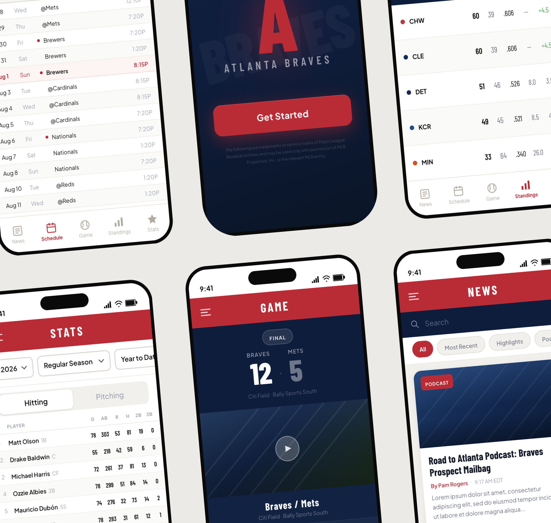
Collage of three tilted mobile mockups showing the redesigned Atlanta Braves app's schedule, game, and standings screens
Role
UX Audit & Redesign
Timeline
4 weeks
Team
Solo project
Tools
Figma, FigJam
Client Type
Self-directed concept project
01

Overview

The existing Atlanta Braves app gave fans access to team news, scores, schedules, standings, and game-day info, but the experience hadn’t kept pace with how fans actually use it. I audited the app and redesigned the flows that matter most on game day.

02

The Challenge

I evaluated the existing screens and identified the usability issues getting in fans’ way: no filter or search capability, and no real-time updates.
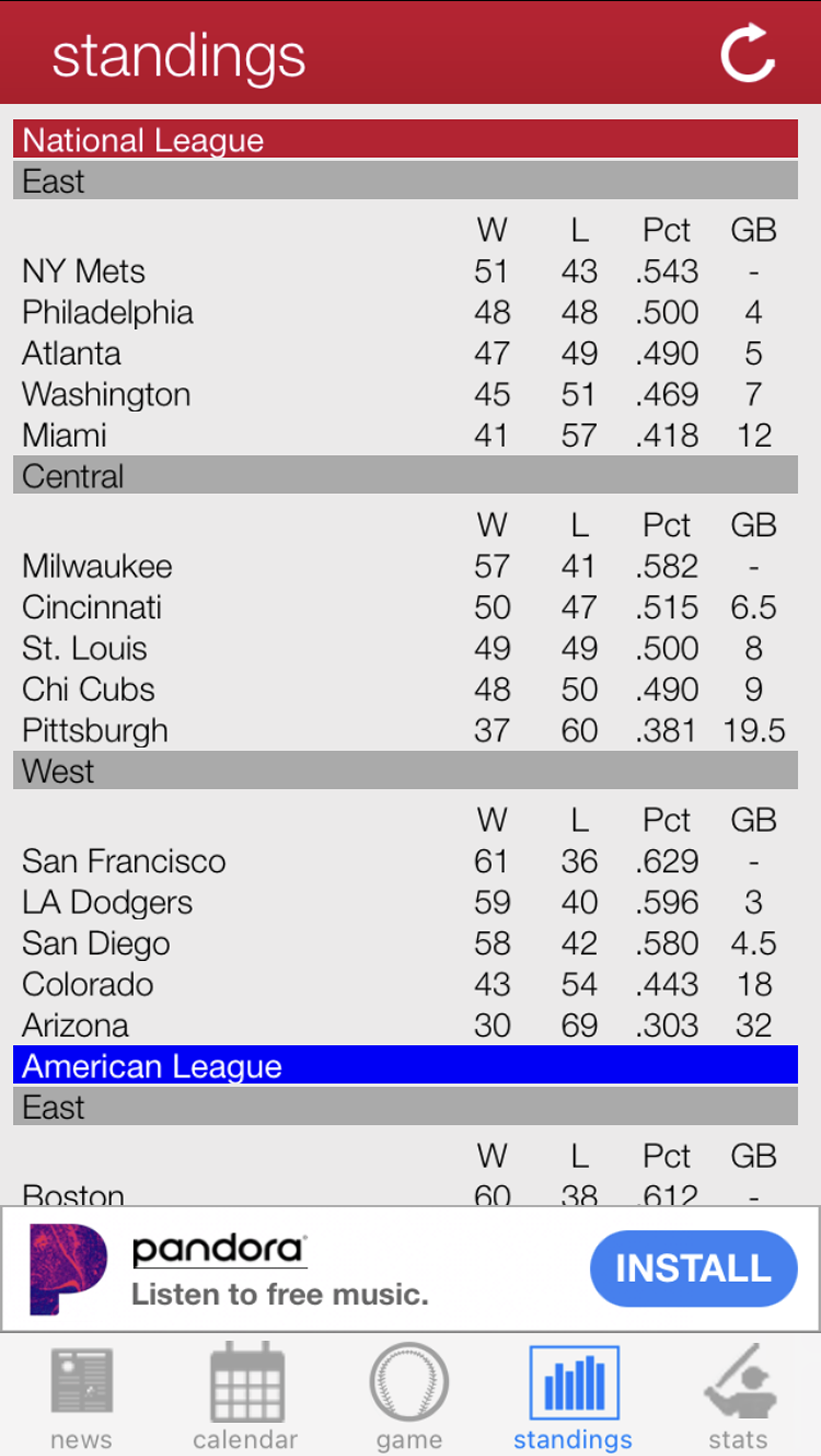
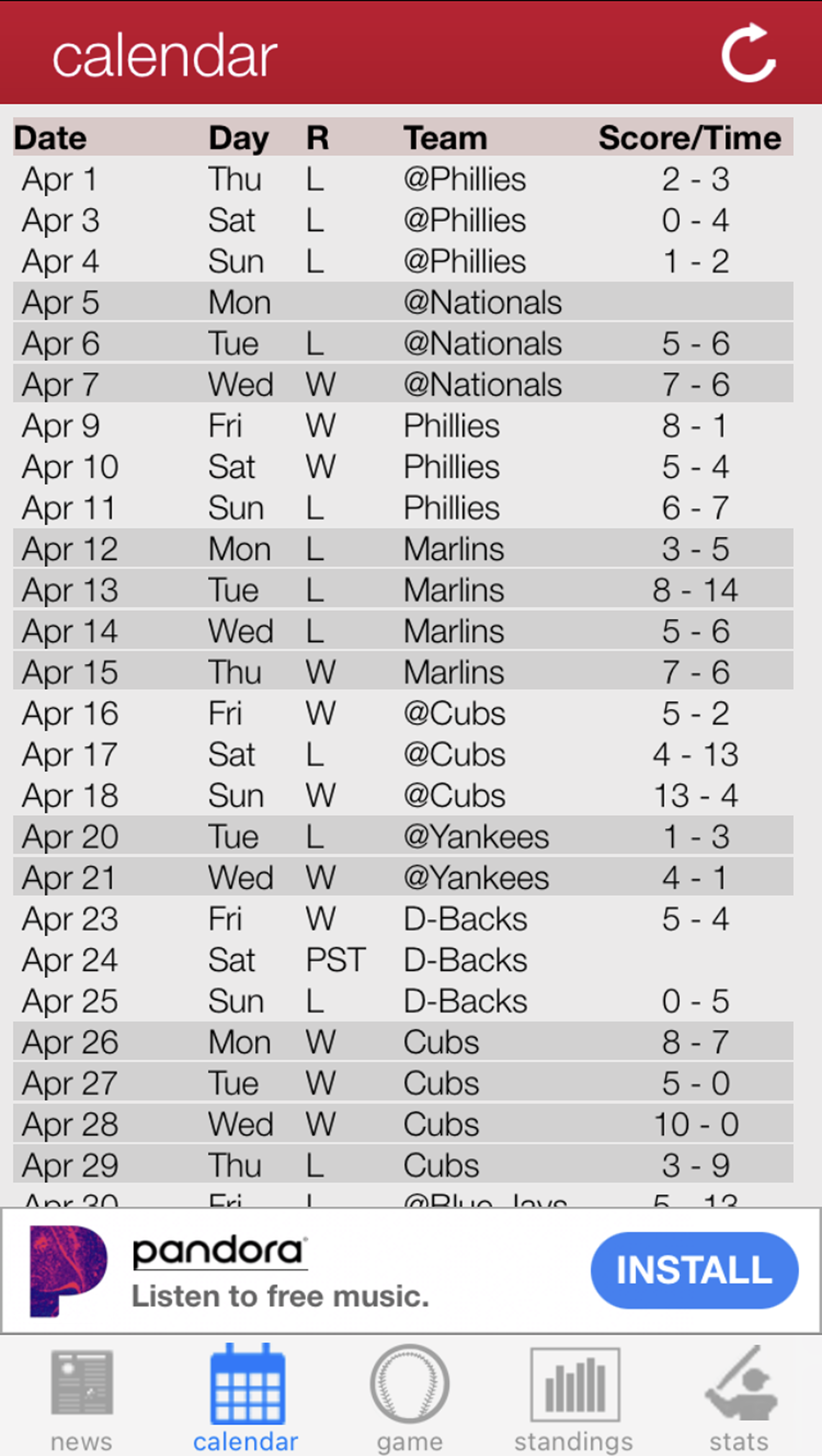
Standings screen: no filter capability
The standings view presents all league and division data in a single list, forcing users to scroll through every team and division to find the specific info they care about.
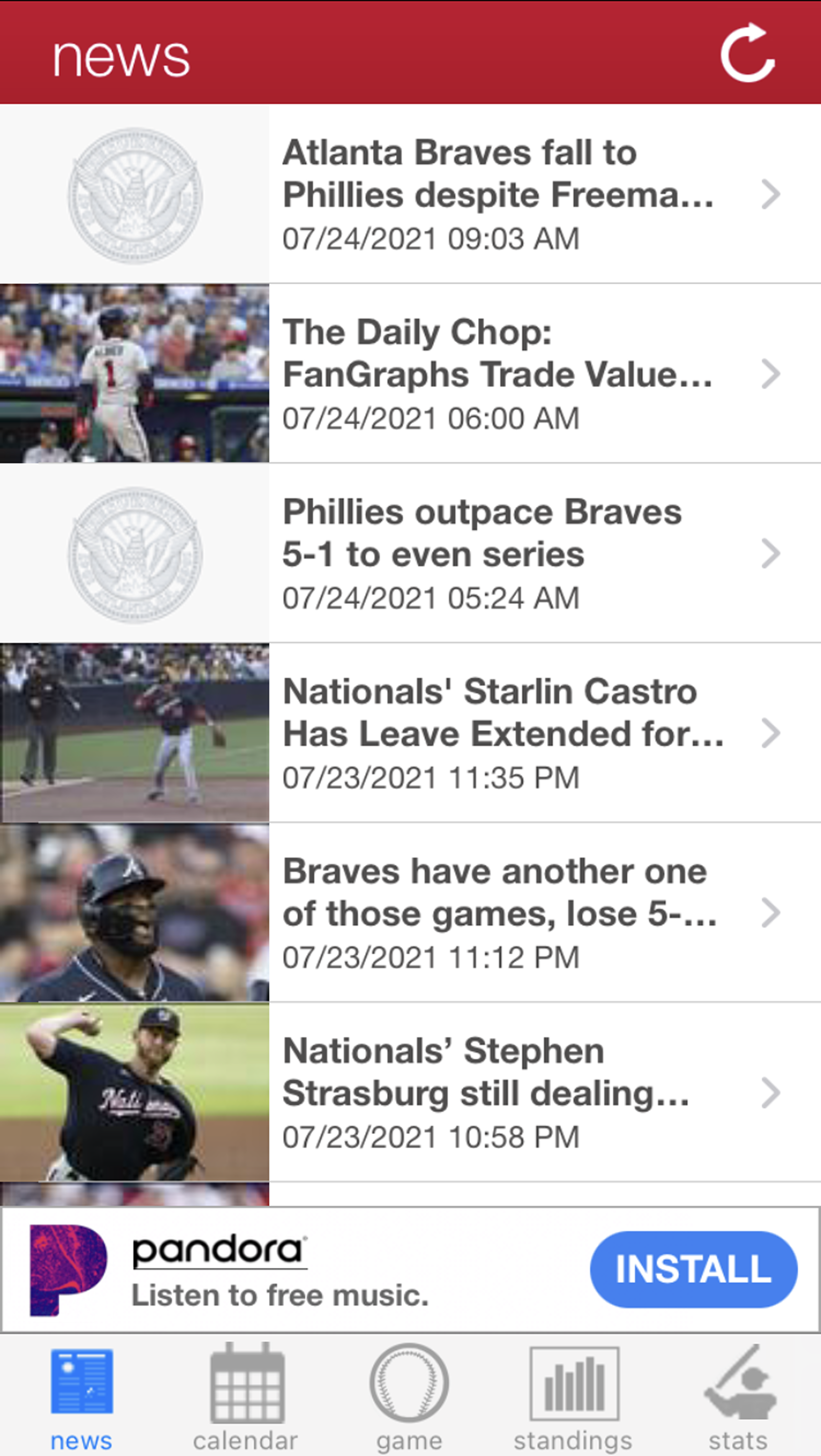
News screen: no search function
Users have no way to quickly locate articles about a specific team, player, or topic, and must scroll through a chronological list of all headlines to find relevant content.
Calendar screen: no real-time updates
The calendar defaults to the start of the baseball season rather than the current date, requiring users to manually scroll through months of past games just to reach today’s schedule.
The App Today: Before Screens
Screenshot of the existing Atlanta Braves app's standings screen listing every league and division without filtering
Standings: every league and division in one unfiltered list.
Screenshot of the existing Atlanta Braves app's news feed as an unfiltered chronological list with no search or category tabs
News: chronological feed with no search or category tabs.
Screenshot of the existing Atlanta Braves app's calendar opening on the season start date instead of today
Calendar: opens on season start, not today’s date.
03

My Approach

I ran a heuristic analysis across the app’s core screens, paired with secondary research and contextual observations from how fans behave on game day.

Findability

Search & Filtering

—No way to filter standings by league or division
—No search across news, players, or teams
—Users forced into linear scrolling to find content
Timeliness

Real-Time Data

—Calendar opens on season start, not today
—No live scoring or in-game updates
—Schedule navigation requires excess scrolling
Game Day

Context & Logistics

—No nearby restaurant or entertainment recommendations
—Parking, ticketing, and stadium info scattered elsewhere
—No single hub for day-of planning
04

The Solution

I created low-fidelity wireframes and a rapid prototype redesign for the News, Schedule, Game, Standings, and Stats screens, reducing friction and making the app more useful for fans who need fast, contextual information.

Wireframes
Low-fidelity wireframe of the redesigned news feed screen with search and category tabs
News
Low-fidelity wireframe of the redesigned standings screen with league and division filters
Standings
Low-fidelity wireframe of the redesigned schedule screen with a calendar toggle and today's game highlighted
Schedule
Low-fidelity wireframe of the redesigned game screen with score, line score, and video highlights
Game
Low-fidelity wireframe of the redesigned stats screen with sortable hitting and pitching tables
Stats
Low-fidelity wireframe of the game-day services hub with parking, weather, and ticket info tiles
All of Your Information in One Place
Prototype
High-fidelity mockup of the redesigned news screen with a search bar, category tabs, and a featured game recap
A filterable news feed with search, category tabs for recent stories, highlights, and podcasts, and a featured game recap.
High-fidelity mockup of the redesigned standings screen with league and division filters and a division table
Division standings with league and division filters, plus win-loss record, percentage, and games-back columns at a glance.
High-fidelity mockup of the redesigned schedule screen with a calendar toggle and today's game highlighted
A full-season schedule with a calendar toggle and today’s game highlighted so fans can find upcoming matchups fast.
High-fidelity mockup of the redesigned game screen showing the final score and an inning-by-inning line score
A live game view with the final score, team logos, an inning-by-inning line score, and quick access to video highlights.
High-fidelity mockup of the redesigned stats screen with sortable hitting and pitching tables
Sortable hitting and pitching stats by season, with year and season-type filters and paginated player tables.
High-fidelity mockup of the game-day services hub with parking, weather, ticket, and stadium policy tiles
A pre-game hub surfacing parking, weather, ticket info, things to do, stadium policies, and feedback in one tap-friendly grid.
What Changed

Before, and after.

Before
Standings screen showed every team and division in one long list with no filter.
After
League and division filters let fans jump straight to the standings they care about.
Before
News feed had no search, so finding a specific player or topic meant endless scrolling.
After
A search bar and category tags surface the right article in seconds.
Before
Schedule defaulted to the start of the season instead of today’s date.
After
Schedule opens on the current date, with today’s game highlighted.
05

What this solved.

— Fans can filter standings by league or division instead of scrolling one long list.
— A search bar and tags on News surface specific players or topics instantly.
— Schedule opens on today’s date, with the current game highlighted by default.
— A new Game Day Services hub consolidates parking, tickets, and stadium info in one place.
Specialties Shown

Auditing a live product and shipping fixes that hold up.

User Experience Audit
Heuristic Evaluation
Content Strategy
Wireframing
Mobile App Redesign
Secondary Research
Product Strategy
Rapid Prototyping
“

[Client or stakeholder testimonial for this project: swap in a real quote when available.]

Client Name
Title, Company

Ready to make your own work this clear?

Whether it's a website, an app, or content that needs a system behind it, let's talk about what that looks like for you.

Start a Project
Next Case Study
emBODY →
MJR
Work Services About Contact
© 2026 Mariah J. Reese